This post explains how to use sliced optimal transport to make blue noise point sets. The plain, well commented C++ code that goes along with this post, which made the point sets and diagrams, is at https://github.com/Atrix256/SOTPointSets.
This is an implementation and investigation of “Sliced Optimal Transport Sampling” by Paulin et al (http://www.geometry.caltech.edu/pubs/PBCIW+20.pdf). They also have code to go with their paper at https://github.com/loispaulin/Sliced-Optimal-Transport-Sampling.
If you missed the previous post that explained sliced optimal transport, give it a read: https://blog.demofox.org/2023/11/25/interpolating-color-image-histograms-using-sliced-optimal-transport/
Generating Points in a Disk
Let’s say we wanted a set of points randomly placed in 2D, but with even density – aka we wanted 2D blue noise points in a square.
We could start by generating 1000 white noise points, then using sliced optimal transport to make them evenly spaced:
- Project all points onto a random unit vector. Calculate how much to move each point to make them be evenly spaced on that 1D line, in the same order.
- Calculate the average of that process done 64 times, then move the points that amount.
- Repeat this process 1000 times.
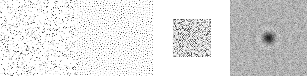
Doing that, we start with the points on the left and end up with the points on the right.
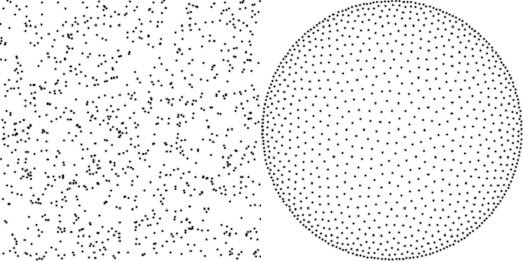
That looks like good blue noise and only took 0.56 seconds to generate, but confusingly, the points are on a disk and are denser near the edges. We’ll make the density uniform in this section, and will make the points be in a square in the next section.
The reason we are getting a disk is because we are projecting the points onto random directions and making the points be on that line, up to a maximum distance away from the origin. That is forcing them to be inside of a disk.
The reason the points are denser near the edges is because we are making the points evenly spaced on the 1D lines, but there is less room vertically on the disk near the edges. That means the points have less space to occupy at the edges, causing them to bunch up.
To account for this, we need to make there be more points in the center, and fewer at the edges. More specifically, we need each point to claim an even amount of disk area, not an even amount of line width.
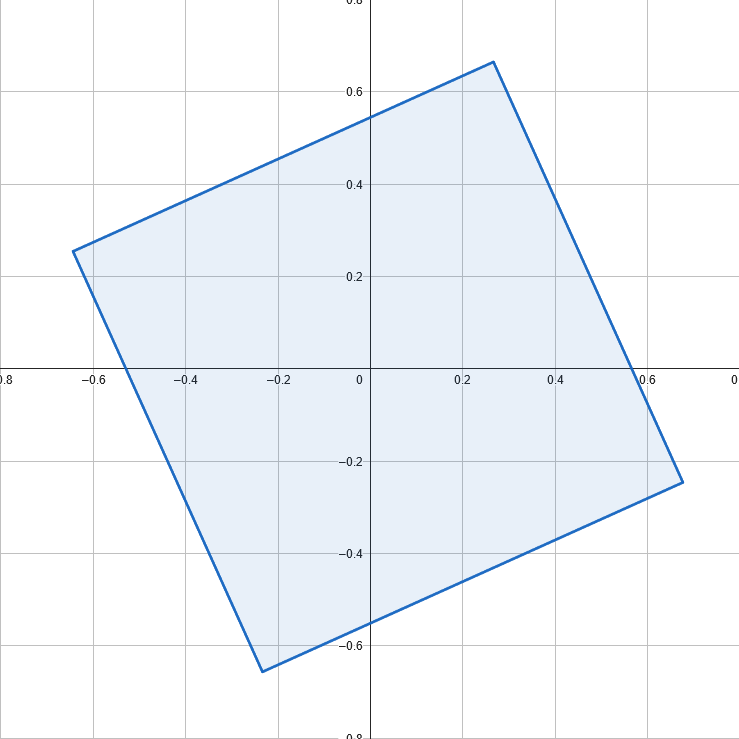
Below shows a circle divided into evenly spaced slices on the x axis (top), and slices of equal area (bottom). (diagram made at https://www.geogebra.org/geometry)

We can do this in a couple of steps:
- Get the formula for the height of the disk has at a given x position. We’ll call this y=f(x).
- Integrate that function to get a y=g(x) function that tells you how much area the disk has at, and to the left of, a given x position.
- Divide g(x) by the area of the disk to get a function h(x) that gives a value between 0 and 1.
- Invert h(x) by changing it from y=h(x) to x=h(y) and solving for y. That gives us a function y=i(x).
- Plug the evenly spaced values we were using on the line into the function i, to get positions on the line that give us equal values of disk area.
This might look more familiar from a statistics point of view. f(x) is an unnormalized PDF, g(x) is an unnormalized CDF, h(x) is a CDF (normalized), and i(x) is an inverse CDF.
If you want a refresher on inverting a CDF, give this a read: https://blog.demofox.org/2017/08/05/generating-random-numbers-from-a-specific-distribution-by-inverting-the-cdf/
If we have a disk centered at (0,0) with radius 0.5, the height of the disk at location x can be found using the Pythagorean theorem. We know x, and the hypotenuse is the radius 0.5, so 


We can take the integral of that to get 

Instead of inverting that function, I made a table with 1000 (x,y) pairs of x and y=h(x). In the table, x is between -0.5 and +0.5, but I also made y be between -0.5 and +0.5. That is a bit different than a CDF where y goes from 0 to 1, but this is just a convention I’m choosing; a standard CDF would work as well. To evaluate i(x), i find the location where the given value shows up in the table as a y value, and give back the x that gave that y value, using linear interpolation.
The sliced optimal transport sampling paper also used a numerical inversion of the CDF, but they did it differently, involving gradient descent. I am happy with the results I got, so think the table is good enough.
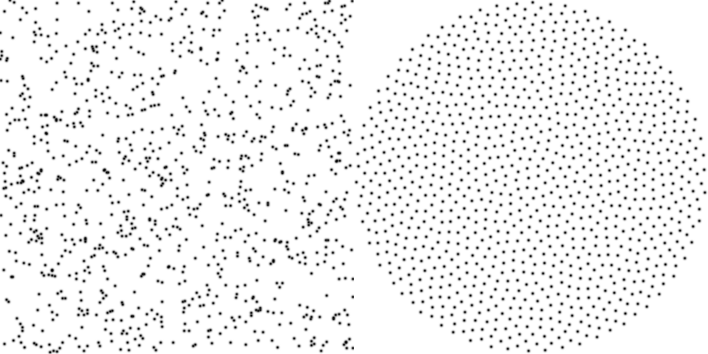
Doing that, we get blue noise points nicely distributed on a disk, and it only took 0.73 seconds to generate.
Blue noise points on a disk are useful for a couple things. If you want to select points to sample on a disk light source (such as the sun, perhaps), you can use blue noise points to get good coverage over the sampling domain, and without aliasing problems from a low sample count. You can also take the (x,y) values of these 2D points and add a Z component with the positive value that makes it a normalized vector (

Fun fact: this projection of a density function (PDF) onto a line is actually a partial Radon transform, which is from Tomography, and relates to how we are able to make images from xrays.
Generating Points in a Square
While points in a disk are useful, we started by trying to make points in a square. To do that, we’ll need to project the area of the square down onto each 1D line, like we did the circle, and use that area to drive where the points go, to make each point have equal area of the square. This is more challenging than the circle case, because a circle is rotationally symmetric, but a square isn’t, so the function to give us evenly spaced points also has to take the projection direction into account.
We ultimately want to project the area of a rotated square onto a 1d line, and use that to give an equal amount of area to each point we distribute along that line.
My mathematically talented friend William Donnelly came up with this function (which is in squaredcdf.h in the repo). The value u should be between -0.5 and +0.5, and will return the x value of where the point should go on the line defined by direction d. The square has width of 1, and is centered at the origin, so the unrotated square corners are at (+/- 0.5, +/- 0.5). A sketch of the derivation can be found at https://blog.demofox.org/2023/12/24/deriving-the-inverse-cdf-of-a-rotated-square-projected-onto-a-line/.
inline float InverseCDF(float u, float2 d)
{
	float c = std::max(std::abs(d.x), std::abs(d.y));
	float s = std::min(std::abs(d.x), std::abs(d.y));

	if (2 * c * std::abs(u) < c - s)
	{
		return c * u;
	}
	else
	{
		float t = 0.5f * (c + s) - sqrtf(2.0f * s * c * (0.5f - std::abs(u)));
		return (u < 0) ? -t : t;
	}
}
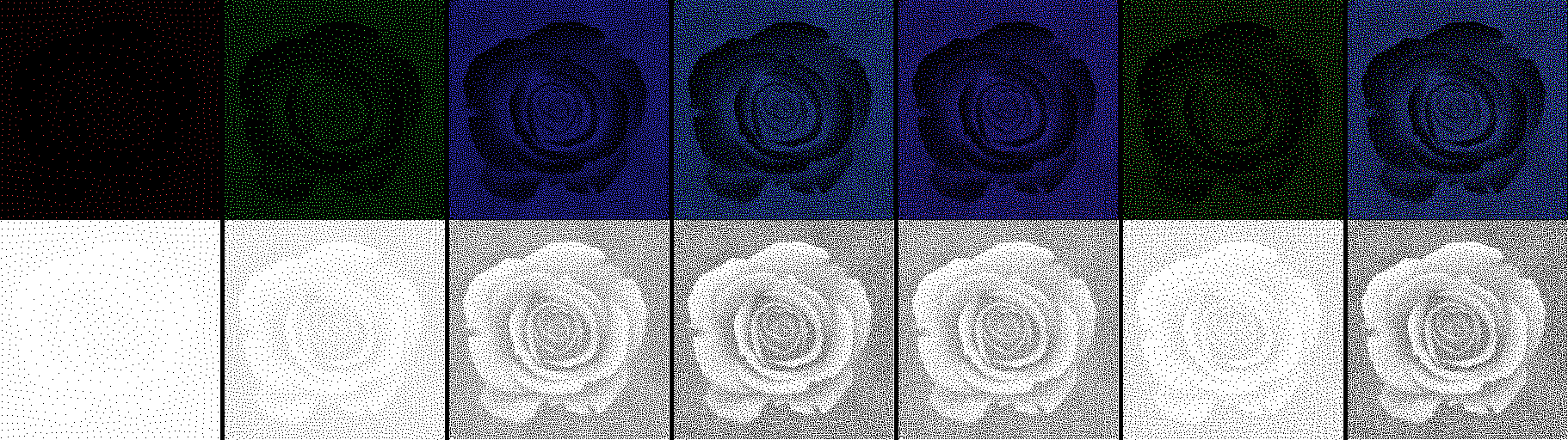
If we use that to space the points along each line, again doing a batch size of 64, and doing 1000 batches, we end up with this, which took 0.89 seconds to generate.
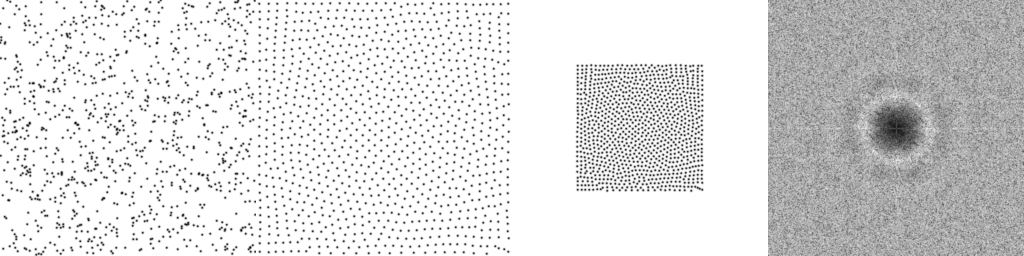
The first image is the starting state, the 2nd and 3rd are the ending states, and last is the DFT to show the characteristic looking blue noise spectrum with a dark circle in the center of suppressed low frequencies.
Regarding the third image, if you think through what’s happening with random projections, and distributing points according to those 1D projections, there is nothing explicitly keeping the points in the square. It’s surprising to me they stay in there so well. The third image shows how well they are constrained to that square.
The blue noise points don’t look that great though. There are some bent line type patterns near the edges, and especially the corners of the square. Unfortunately, these points seem to have reached a point of “overconvergence” where they start losing their randomization. You can see the same thing in the sliced optimal transport paper. One solution to this problem is to just not do as many iterations. Below is what the point set looks like after one tenth of the iterations, or 100 batches. The DFT shows stronger lower frequencies, but the visible patterns in the point sets are gone. As we’ll see further down, adjusting the batch size may also help.
Comparison To Other Blue Noise Point Sets
Below are shown three types of blue noise point sets, each having 1000 points. Points are on the left, and DFT is on the right to show frequency characteristics.
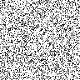
- Dart Throwing – Points are placed in a square going from [0,1]. Each point is generated using white noise and is accepted if the distance to any existing point is greater than 0.022. I had to tune that distance threshold by hand to make it as large as possible, but not so large that it couldn’t be solved for 1000 points. Wrap around / toroidal distance is used: (https://blog.demofox.org/2017/10/01/calculating-the-distance-between-points-in-wrap-around-toroidal-space/)
- Sliced Optimal Transport aka SOT – The method in this post, using a batch size of 64, and 100 iterations.
- Mitchell’s Best Candidate – For the Nth blue noise point, you generate N+1 candidate points using white noise. Keep whichever point is farthest from the closest existing point. Wrap around / toroidal distance is used. (https://blog.demofox.org/2017/10/20/generating-blue-noise-sample-points-with-mitchells-best-candidate-algorithm/)
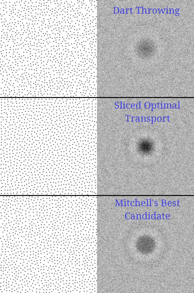
I’d say dart throwing is the worst, with a less pronounced dark ring in the frequency domain. For the best, I think it’s a toss up between SOT and MBC. MBC suppresses more of the low frequencies, but SOT more strongly suppresses the frequencies it does suppress. We saw earlier that doing more iterations can increase the size of the dark circle in the DFT, but that it makes the point set too ordered. It may be situational which of these you want. There is a big difference between using blue noise point sets for organic looking object placement in a game, and using blue noise point sets for sparse sampling meant to then be filtered by a matching gaussian filter. The first is an artistic choice and the second is a mathematical one.
There other methods for generating blue noise point sets. “Gaussian Blue Noise” by Ahmed et al. is the state of the art, I believe: https://arxiv.org/abs/2206.07798
Algorithm parameters
A batch size of 64 is used in generating all the point sets so far. Here’s what other batch sizes look like, at 1000 iterations.
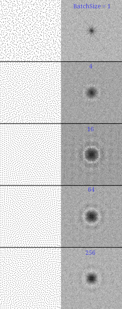
it looks like increasing batch may also be a way to get rid of the regularity we saw before at a batch size of 64, after 1000 iterations. More investigation needed here, but being able to run an algorithm to completion, instead of having to stop it early at some unknown point, is a much better way to run an algorithm.
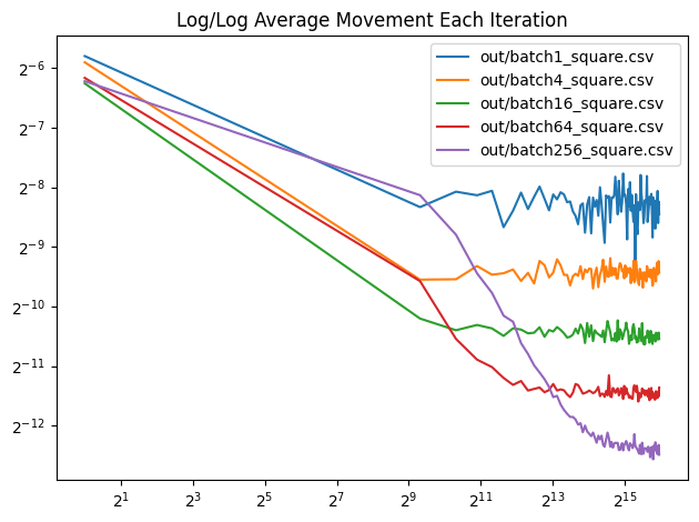
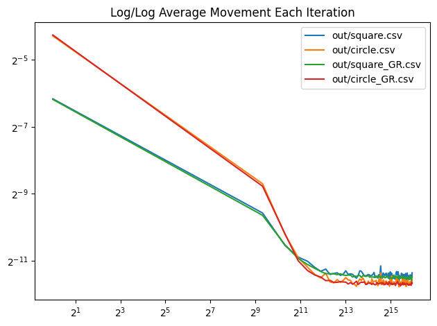
Here is a log/log convergence graph that shows average pixel movement each batch. The x axis is the total number of random lines projected, which is constant across all batch sizes. The number of iterations is increased for smaller batch sizes and decreased for larger batch sizes to give an “equal computation done” comparison. This isn’t necessarily a graph of quality though, it just shows each batch size reaching the final state, whatever quality that may be. More investigation is needed.
We’ve been using white noise for generating the random directions to project onto. What if we instead used the golden ratio low discrepancy sequence to generate pseudorandom rotations that were more evenly spaced over the circle? Below is a graph that shows that for both square and circle, 1000 iterations of a batch size of 64. The golden ratio variants move slightly less, and move less erratically, but the difference seems pretty small.
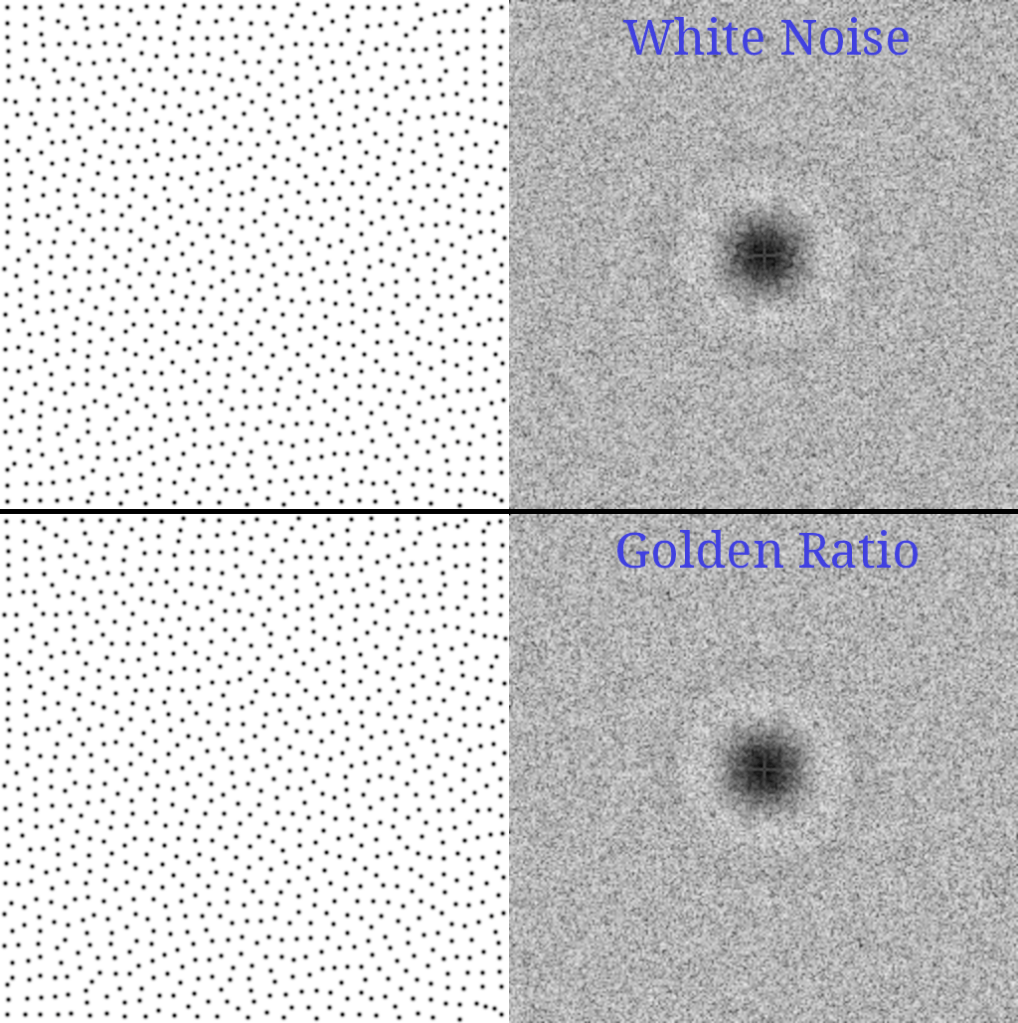
I can’t tell much of a difference in the disk points:
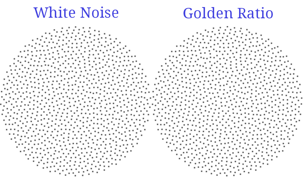
And the square points look real similar too. The DFT does seem smoother for the golden ratio points though, and the light circle around the dark center seems to be less lumpy. This might be worth looking into more later on, but it seems like a minor improvement.
I think it could also be interesting to try starting with a stratified point set, or a low discrepancy point set, instead of white noise, before running the SOT algorithm. That might help find a better minimum, or find it faster, by starting with a point set that was already pretty well evenly spaced. Perhaps more generally, this algorithm could start with any other blue noise point set generation method and refine the results, assuming that the points created were lower quality than this algorithm can provide.
Using Density Maps
Generating these sample points using sliced optimal transport involves projecting the area of where we want our points to be down onto a 1D line, and using that projected area as a PDF for where points should go to get equal amounts of that projected area.
What if instead of projecting down a shape, which projects a boolean “in shape” or “not in shape” onto the line, what if we instead used a greyscale image as a density map and projected the pixel values down onto the line to make a PDF?
I did that, projecting each pixel of a 512×512 image down onto 1000 buckets along the line, adding the pixel value into each bucket it touches, but multiplying the pixel value by how much of the bucket it takes up. The pixel values are also inverted so that bright pixels are places where dots should be less dense, because I’m doing black dots on a white background.
Below right is the image used as the density map. Below left is the starting point and below middle is the final result, using 20,000 points, 1,000 iterations and a batch size of 64. It took 50 seconds to generate, and I think it looks pretty nice! I’m amazed that doing random 1d projections of an image onto a line results in such a clean image with such sharp details.

The reason this takes so much longer to generate that the other point sets seen so far is the looping through all 512×512=262,144 pixels and projecting them down onto the 1d line for each random projection vector. I’ve heard that there are ways to make this faster by working in frequency space, but don’t know the details of that.
In game development, perhaps this could be used to place trees in a forest, where a greyscale density texture controlled the density of the trees on the map.
I haven’t ever seen it before, but you could probably use a density map with both dart throwing and Mitchell’s best candidate as well. Both of those algorithms calculate distance between points. You could get the density value for each point, convert that density to a radius value, and subtract the two radius values from the distance between the points. It would be interesting to compare their quality vs these results.
Generating Multiclass Samples
Multiclass blue noise point sets are blue noise point sets where each point belongs to a class. Each class of points should independently be blue noise, but combined combinations of classes should also be blue noise.
The “Sliced Optimal Transport Sampling” paper that this post is exploring has support for this. Every other iteration, after projecting the points onto the line and sorting them, they then make sure the classes are interleaved on that line. They show it for 2 and 3 classes with equal point counts.
If using this for placing objects on a map, you might have one class for trees, another class for bushes, and another class for boulders. However, you might not want an equal number of these objects, or equivalently, you may want more space between trees, than you want space between bushes. To do that, you’d need to have different point counts per class.
Luckily that ends up being pretty easy to do. Let’s say we have three classes with weights 1, 4 and 16. Those sum up to 21. When generating your random points, you can use the point index to calculate which class it is:
int class = 2;
if (index % 21 == 0)
  class = 0;
else if (index % 21 < 5)
  class = 1;
Then, when doing the “interleave” step that is done every other iteration, after sorting the points, we make sure that there is a class 0, then four class 1s, then sixteen class 2s, repeating that pattern over and over.
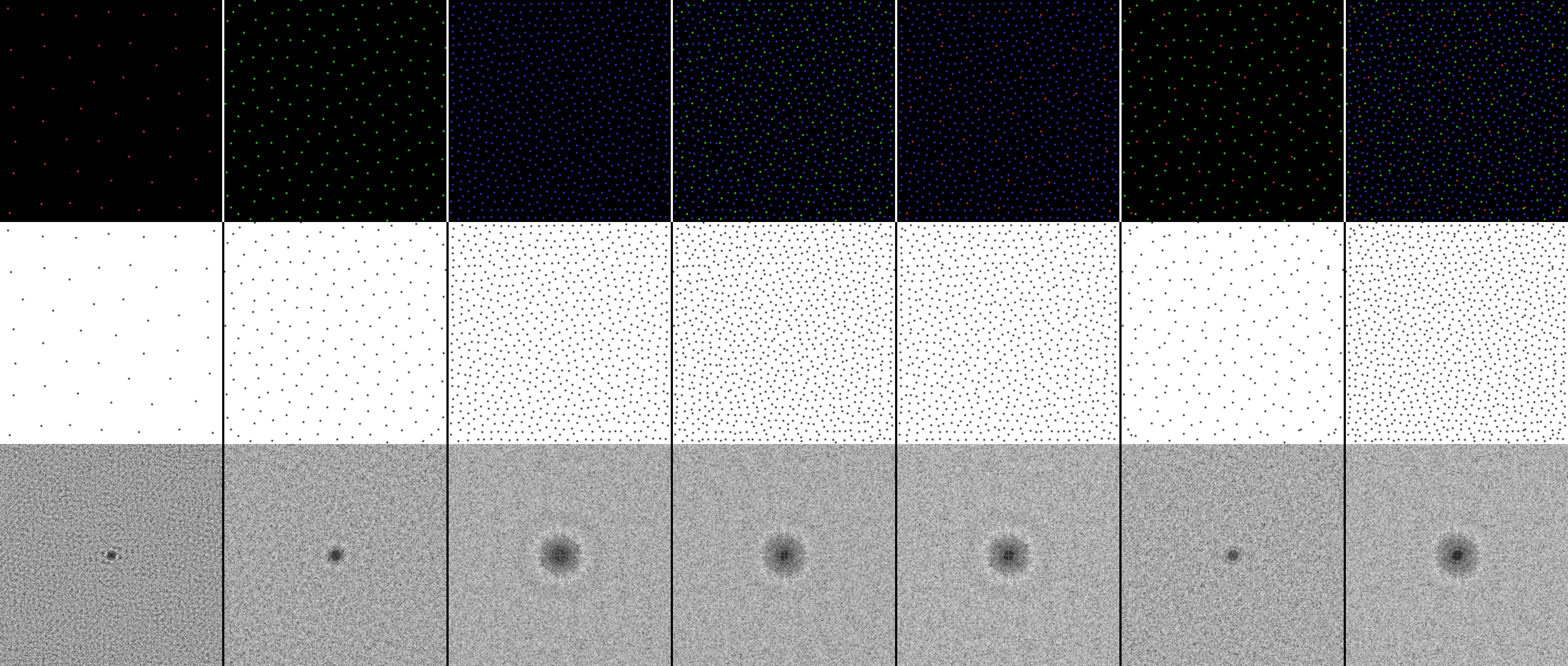
Doing that in a square, with 1000 points, 1000 iterations, and a batch size of 64 gives us this, which took 0.57 seconds to generate. Click the image to see it full sized in another window. The top row shows the classes as colors RGB. The middle shows the combined point set, and bottom shows the DFT.
This works just fine with density maps too, generating this in 49 seconds:
Optimal Transport
Generating multi class and uneven density blue noise point sets works well using sliced optimal transport, but where is the actual optimal transport of this, and what exactly is being transported?
Going back to the last post’s explanation of optimal transport being about finding which bakeries should deliver to which cafe’s to minimize the total distance traveled, the initial point sets are the bakeries, and instead of there being discrete cafe’s, the PDF / density maps define a fuzzy “general desire for baked goods in an area”.
The optimal transport here is finding where to deliver baked goods to most evenly match demand for baked goods, and doing so, such that the sum of the distance traveled by all baked goods is minimized.
When we run the sliced optimal transport algorithm, we do eventually end up with the points being in the “optimal transport” position at the end, but the path that the points traveled to get there are not the optimal transport solution.
The optimal transport solution is the line from the initial point locations to their ending locations. That optimal transport solution will be a straight line, while the path the points took in SEARCH of the optimal transport solution may not be straight lines.
Below is the evolution of 20,000 points as they search for the optimal transport solution, over 100 iterations, with a batch size of 64. The points are not taking the path of optimal transport, the points are searching for their final position for the optimal transport solution.
Below is an animation that interpolates from the starting point set, to the ending point set, over the same amount of time (100 frames). This is the points taking the path of the optimal transport solution!

Closing
The paper which introduced dart throwing was “Stochastic sampling in computer graphics”, Cook 1986. That paper explains how in human eyes and some animals, the fovea (the place where vision is the sharpest) places photoreceptors in a hexagonal packing. This is interesting because a hexagonal grid is more evenly distributed than a regular grid, which has diagonal distances 50% longer than cardinal distances. Outside of the fovea, where the photoreceptors are sparser, a blue noise pattern is used, which is known to be roughly evenly spaced, but randomized which avoids aliasing.
To me, this is nature giving us a hint for how to do sampling or rendering. For best quality and higher sample counts, a hex grid (or more generally, a uniform grid) is best, and for lower / sparser sample counts, blue noise is best.
That information is in section 3 https://www.cs.cmu.edu/afs/cs/academic/class/15869-f11/www/readings/cook86_sampling.pdf
I hope you enjoyed this. Next up will be a post looking more deeply at an interesting 2022 paper “Scalable multi-class sampling via filtered sliced optimal transport” (https://www.iliyan.com/publications/ScalableMultiClassSampling). That paper is what convinced me I needed to learn optimal transport, and is what led to this series of blog posts.


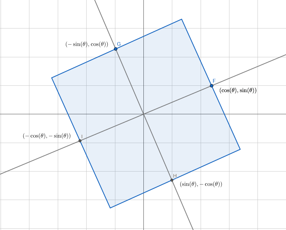
 ) is the angle that our square is rotated by.
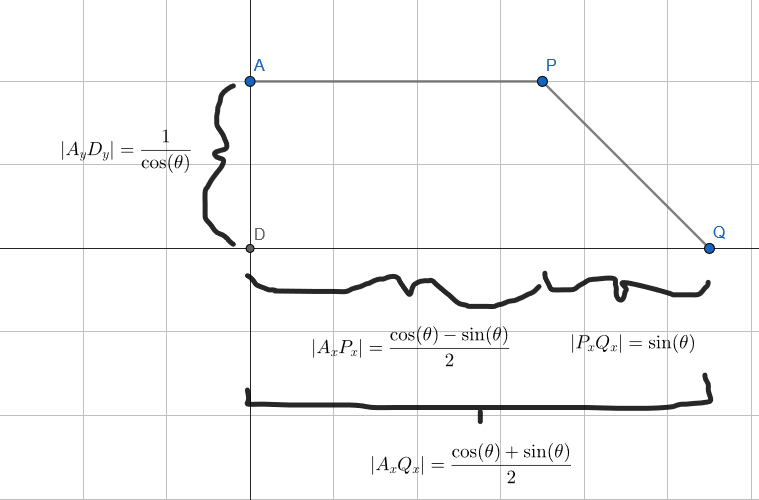
 . This is the point at which our height equation needs to change to a different formula.
 .
. . We also know that the area is a linear function (it’s the top line minus the bottom line). So, to get the 2nd part of our height function, we are trying to find the formula of the second between P and Q below: