
This is a follow up to an article I wrote a few years ago on Monte Carlo integration and importance sampling in 1D: https://blog.demofox.org/2018/06/12/monte-carlo-integration-explanation-in-1d/
The simple, well commented code that generated all the data for this post can be found at: https://github.com/Atrix256/mis/
A challenge when doing Monte Carlo integration in rendering is that the function you are trying to integrate is often made up of other functions multiplied together. While you may know how to importance sample some of the parts individually, you ultimately have to choose which thing to importance sample, because you are generating random numbers according to whichever thing you choose.
In rendering, the three things usually being multiplied together are lighting, material and visibility (which makes shadows). Lighting and materials are things you can usually importance sample and are based on the type of light (like a spherical area light) and the material model (Like a PBR microfacet BRDF), while visibility is not usually able to be importance sampled because it is entirely due to the geometry in a scene as to whether a pixel can see a light or not.
If you importance sample based on lighting, you can get poor results when the material ended up being more important to the result. Likewise, if you importance sample based on material, you can get poor results when the lighting ended up being more important to the result.
Multiple importance sampling is a way to make it so that you don’t have to choose, and you can get the benefits of both. More generally, it lets you combine N different importance sampling techniques.
TL;DR
Before going into the explanation, here is how you actually get 1 MIS sample using the balance heuristic, when you have two importance sampling techniques:
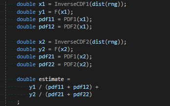
F is the function being integrated. PDF1 / InverseCDF1 are for the first importance sampling technique. PDF2 / InverseCDF2 are for the second importance sampling technique. You do this in a loop N times, and take the average of those N estimates, to get your final estimate.
You can generalize to more techniques by just following the pattern. Each sampling technique generates it’s own x and y. Each sampling technique calculates the pdf for that x value for each of the other pdfs. The estimate is the sum of: each y value divided by the sum of each pdf for the corresponding x value.
Note that if part of the function F is expensive (like raytracing for visibility!) you don’t have to do that for each sample. You could get your estimate of lighting multiplied by material like in the above, and after combining them, you could then do your raytracing to multiply in the visibility term.
MIS Explained
You can get a single sample from a monte carlo estimator by randomly generating an x value and calculating the estimate as the function value at that x, divided by the PDF value of choosing that x.
You may also remember that as the shape of the pdf (histogram) of the random numbers gets closer to the shape of the function you are trying to integrate, that you can get a closer estimate to the actual answer with fewer samples. This is called importance sampling.
Let’s say though that you want to integrate the function f multiplied by the function g and you are able to generate random numbers in the shape of f, and random numbers in the shape of g, but not random numbers in the shape of f multiplied by g.
You know that you can choose to importance sample based on f or g, but that the choice is better or worse situationally. Sometimes you want f, other times you want g.
The simplest way to combine these would be to just use them both for each sample and average them. You could also switch off so that even numbered samples importance sampled by f and odd numbered samples importance sampled by g. This is the same as giving each technique a weighting of 0.5.
We can do better though!
We can make an x value to importance sample based on f, and another x value to importance sample based on g, and then we can calculate the PDF values of each x for each PDF.
If we have good importance sampling PDFs, higher PDF values mean higher quality samples, while lower PDF values mean lower quality samples. We now have the means to give a weighting to a sample based on it’s quality as shown below, where we calculate the weight for sample “A”. Sample “B” would do the same.

This is called the “balance heuristic”. There are other heuristics that you can use instead, which you can read about in Veach’s thesis (in the links section) and other MIS papers which have come out since then.
If we have a Monte Carlo estimate sample like this:

Some interesting cancelation happens if we multiply that by the weight.

That form is the same form seen in the code from the last section, where we also had a sample B that we added to it to get the final estimate.
You may be wondering why sample A and sample B are added together… shouldn’t they be averaged?
Well, if you look at the denominator in that last formula, two PDFs are added together. Each PDF has an expected value of 1, so the expected value of that sum in the denominator is going to be 2. That means that the estimate is going to be half as big as it should be. When you add two of them together, they are going to be as large as they should be. All that has happened is that instead of adding them together and dividing by two to average them, we have divided them by two implicitly in advance before adding them. We are still averaging the two samples. It isn’t exactly averaging, since the PDFs will vary from sample to sample, but on the whole, it’s still an unbiased combination of the two PDFs, which is why we still get the correct answer.
If three PDFs were involved, the weighted samples would be one third the size they should be, and there would be three to add together.
If four PDFs were involved, the weighted samples would be one fourth the size they should be, and there would be four to add together.
It generalizes to any number of importance sampling techniques involved.
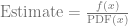
One Sample MIS
If you are a fan of stochastic rendering like me, you may be wondering if you really have to do both (all) of the samples, or if you can use the weighting to choose one stochastically and end up with the correct result for less work.
Yes, you can indeed do this and in Veach’s thesis he calls this the “One-Sample Model” in section 9.2.4.
In this case, what you do is calculate the weight for each sample, and then divide each of those weights by the sum of the weights to get a probability for taking that specific sample.
After you roll a random number and choose the single sample to contribute to the estimate, you need to multiply the Monte Carlo estimate by the chance of choosing that item. You are left with something that uses multiple PDFs for importance sampling different parts of the function, but each sample evaluates the function F only once. Useful if F is costly to evaluate.

If you expand out weight1, weight2 and weight1chance, you’ll find that some things cancel out and you are left with the below for actually calculating the estimate. I have to admit I don’t have a good intuitive explanation for why that works, but the algebra says it does, and it checks out experimentally. If you have an explanation, leave a comment!
Piecewise Importance Sampling
Multiple importance sampling is a method for combining any number of importance sampling techniques to sample a specific function.
Something interesting though is that not every PDF involved has to cover the entire function.
What i mean is that you could have a PDF which sampled only from the left half of the domain of a function, and another PDF which sampled only from the right half of the domain of a function.
What would happen is that the inverse CDF for the first technique would only generate x values on the left half of the function to integrate, and the PDF would give zero for any value on the right have of the function.
The second technique would do the opposite.
MIS would not care about this in the least. It would function as normal and let you importance sample a function piecewise, if you could make PDFs that fit the parts of a function well, but weren’t able to make a PDF that fit the entire function well.
Veach’s thesis goes into other things as well, such as being able to give different sample counts to different techniques. It’s definitely worth a read!
Experiment #1 – Importance Sampling & Warm Up
Quick reminder, the code that made the data for these experiments is at: https://github.com/Atrix256/mis/
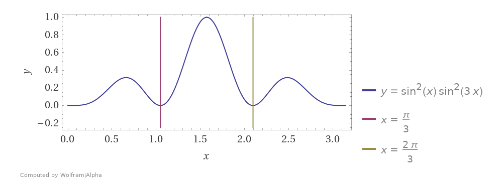
First up we are going to integrate the function 

We could show the absolute value of the error at each step (the error being averaged over all those tests) and get this. (data from out1.abse.csv)
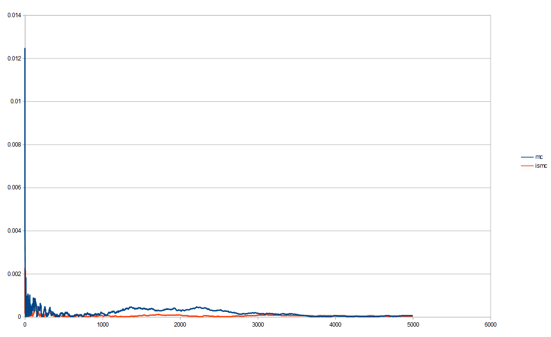
That isn’t super easy to read other than seeing importance sampling seems to be less erratic and lower error more reliably. We can change it to be on a log/log plot which helps see decay rates better (especially when things like low discrepancy sequences are involved, which we’ll see later).
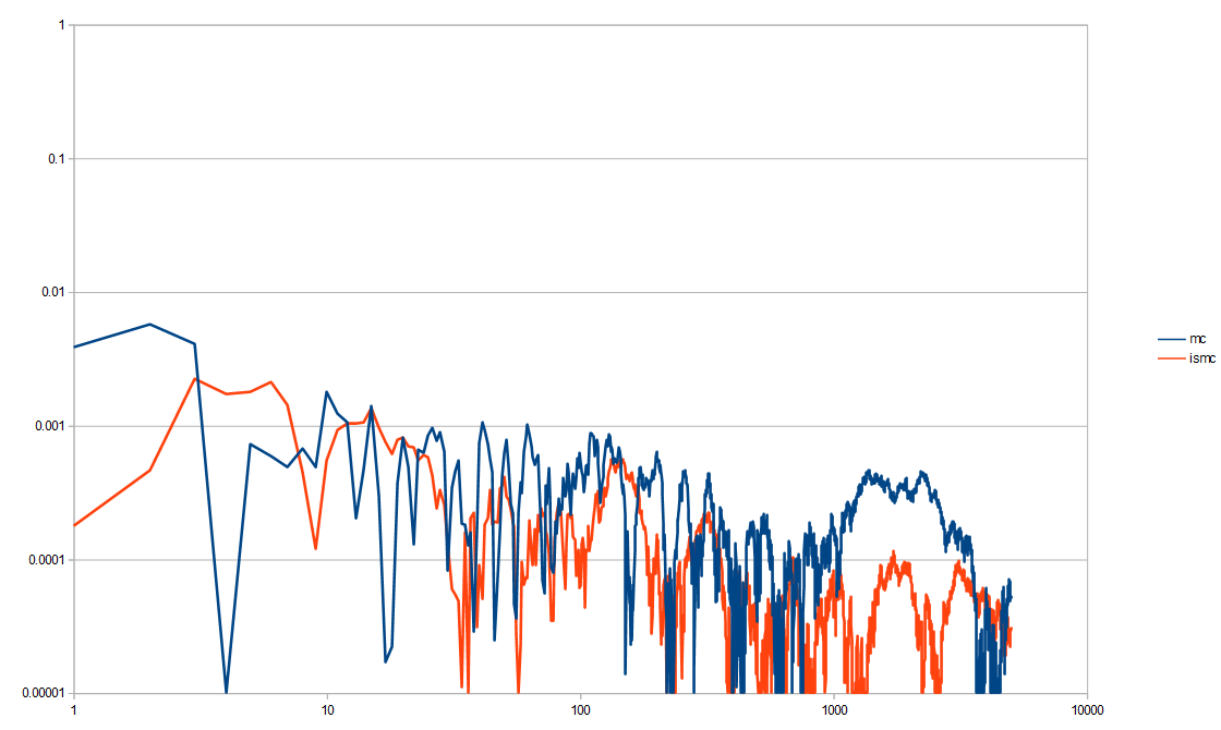
That’s an improvement, but there is a lot of noise, even after 10,000 tests. Monte Carlo is noisy by definition, so as you can see, sometimes it gets really low error, but then pops right back up in the next few samples. That erratic nature is not good and if you are doing integration per pixel, the variance will make the noise especially bad. In fact, variance is what we really care about. So long as the integration is converging to the right thing (is unbiased / has zero bias), variance will tell us how quickly it is converging on the right answer.
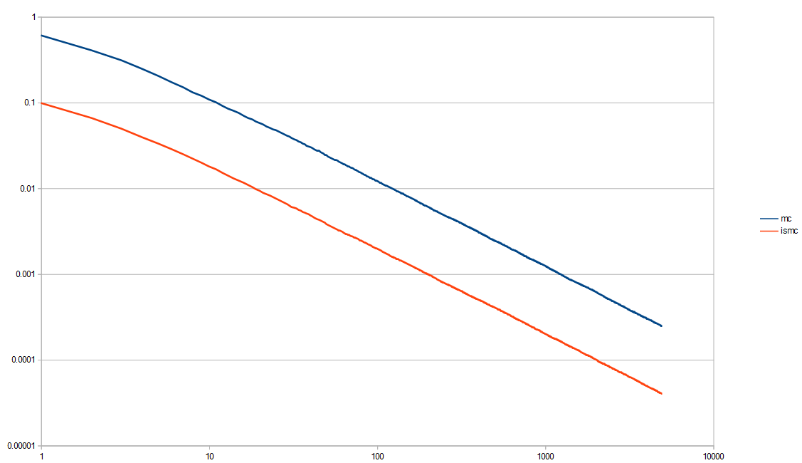
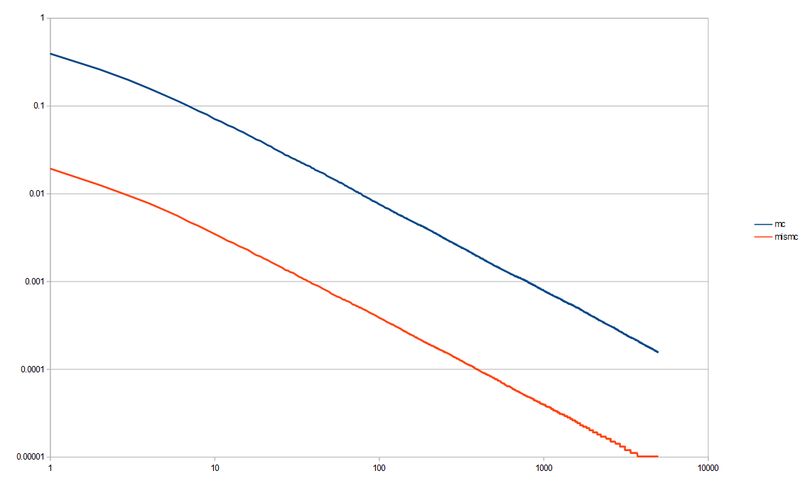
Here is a log/log variance graph. You can more easily see that the importance sampling is a clear win over the non importance sampled Monte Carlo Integration. (data from out1.var.csv)
Now that we see that yes, importance sampling is helpful, and we have our testing conventions worked out, let’s continue on to more interesting topics!
Experiment #2 – Multiple Importance Sampling
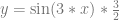
Next up, we are going to integrate the function 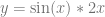


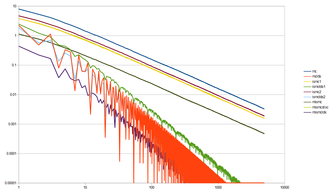
Here is the log/log variance graph.
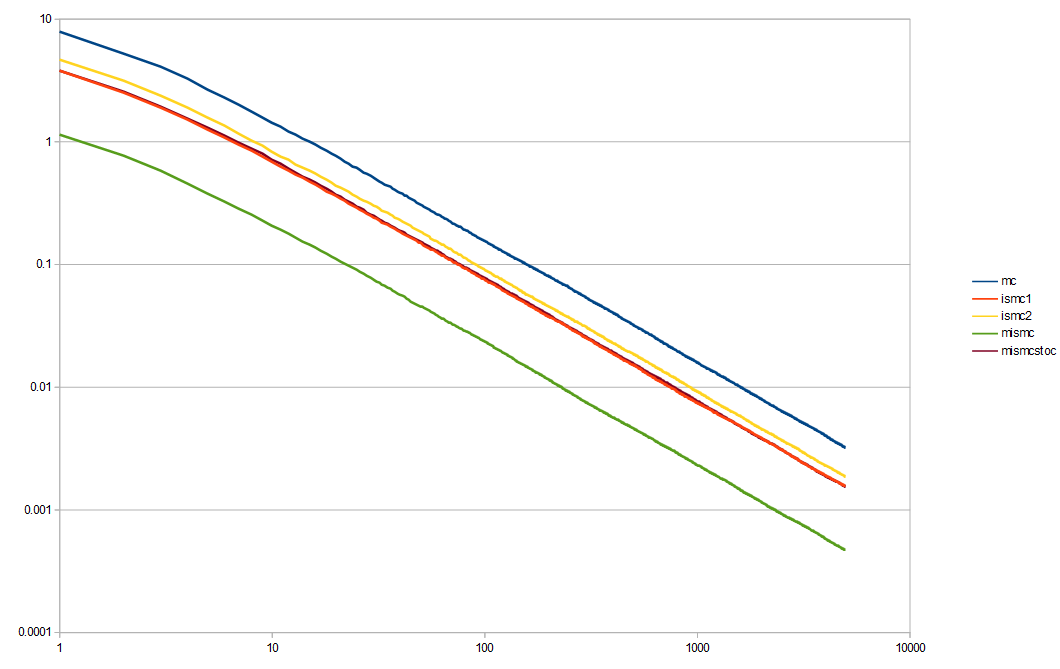
Monte Carlo (mc, blue) is the obvious worst. Multiple importance sampling (mismc, green) is the obvious best. The second place worst is importance sampling by the line function (ismc2, yellow). The second place best is importance sampling by the sin based PDF (ismc1, red). The one sample method (mismcstoc, purple) seems to be basically the same as the red line. It takes half as many samples as mismc, so it isn’t surprising that it does worse.
It is good to see that multiple importance sampling is worth while though and does significantly better than the two importance sampling methods involved do by themselves.
Experiment #3 – Piecewise Importance Sampling
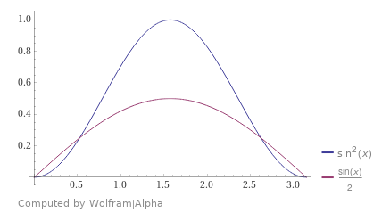
Next we are going to do piecewise MIS. We are going to integrate 
Here is the function we are integrating, showing the 3 zones the PDFs cover:
Here is the first of the PDFs. The other two look the same but are shifted over on the x axis.
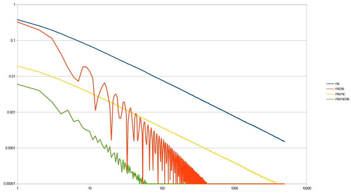
Here is the variance for regular Monte Carlo versus the piecewise importance sampling, showing that it is a significant improvement to do the piecewise IS here.
Experiment #4 – Low Discrepancy Sequences
Unsurprisingly it turns out that low discrepancy sequences are useful when doing multiple importance sampling. It would be fun to look at using LDS in MIS / IS deeper in a future blog post, especially because things change in higher dimensions, but here are some interesting results in the mean time.
Here is the first experiment, which compared Monte Carlo (mc, blue) to importance sampling (ismc, yellow), now also using low discrepancy sequences for both.

For low discrepancy Monte Carlo (mclds, orange), instead of using white noise independent random numbers 0 to 1 to make my x values, I start the x value at a random number in 0 to 1 for the first sample x value, but then I add the golden ratio to it and use modulus to keep it between 0 and 1 for each subsequent sample. This is the “Golden Ratio Additive Recurrence Low Discrepancy Sequence”. That beats both Monte Carlo, and importance sampled Monte Carlo by a significant amount.
For low discrepancy importance sampled Monte Carlo (ismclds, green), I did the same, but put that sequence through the inverse CDF to generate numbers from that PDF, using LDS as input. It’s worked well here in 1D, but mixing LDS and IS can be problematic in higher dimensions due to the LDS being distorted from the importance sampling warping, and then losing it’s low discrepancy properties.
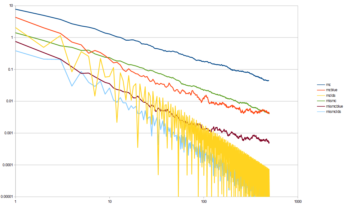
Here is the second experiment, which compared MC to IS to MIS, now including low discrepancy sequences:
Everything improved by using LDS, but interestingly, the order of best to worst changed.
Not using LDS, multiple importance sampling was the winner. Using LDS, MIS is still the winner. Since there are two streams of random numbers needed for the MIS (one for each importance sampling technique), I used a different low discrepancy sequence for each. For the first technique, i used the golden ratio sequence. For the second technique, I did the same setup, but used the square root of two instead of the golden ratio. The golden ratio is the best choice for this kind of thing, because it is the most irrational number, but square root of two is a pretty good second choice.
Not using LDS, Monte Carlo was the worst performing, but using LDS, Monte Carlo is in the middle, and it’s the first importance sampling technique that does the worst. The second importance sampling technique is in the middle whether you use LDS or not though.
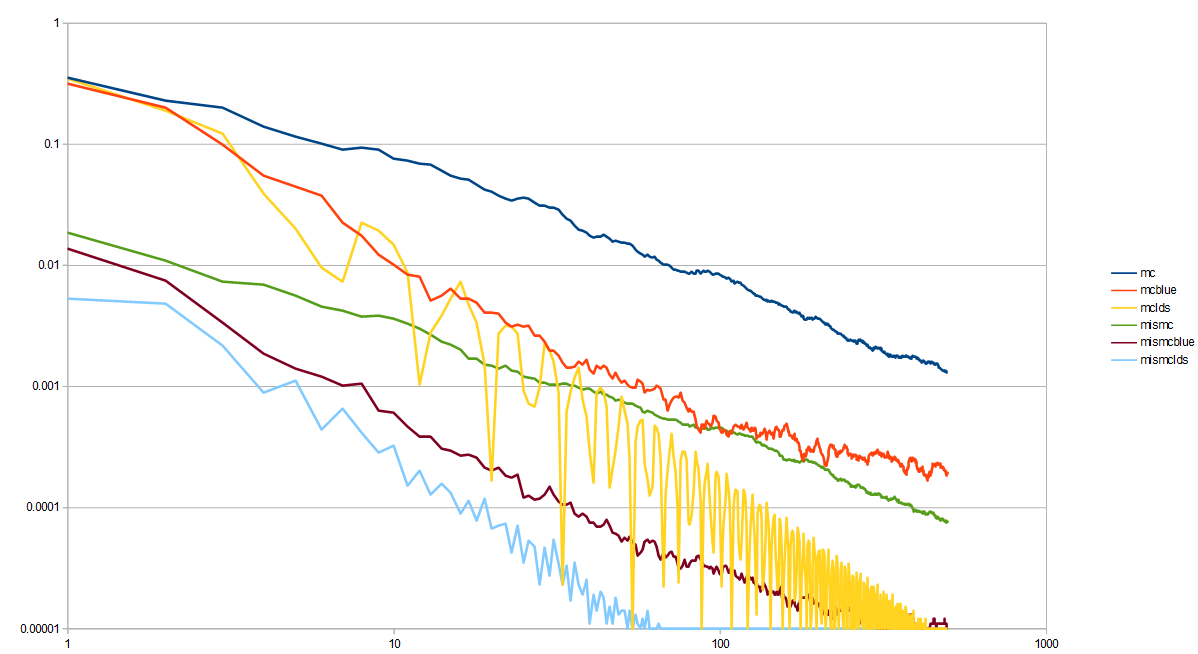
Here is the third experiment now with LDS, which compared Monte Carlo to a piecewise importance sampled function.
This MIS here needs 3 streams of random numbers, so for the LDS, I used the golden ratio sequence, the square root of 2 sequence, and a square root of 5 sequence. Once again, LDS helps convergence quite a bit in both cases!
I’m starting to run out of “known good irrational numbers” so I’m glad we are at the end of the LDS experiments. There are other type of low discrepancy sequences that don’t use irrational numbers, but then you start having to consider the LDS quality along with the results and all the permutations. If you want to go into a deep dive about irrational numbers, give this article of mine a read: https://blog.demofox.org/2020/07/26/irrational-numbers/
Before moving on, look at that last graph again. The amount of variance that 5,000 white noise samples has is the same variance that piecewise importance sampling had, when using only 10 low discrepancy samples. Without LDS though, even the MIS strategy took something like 800 samples to reach that level of variance.
In graphics, these samples could easily represent rays shot into the world for something like global illumination, soft shadows, or raytraced reflections.
It would be real easy to try the most naive Monte Carlo algorithm, find out that you need 5000 samples to converge and give up.
Facing this, you may bust out the MIS and try to do better, finding that you could cut the cost to about 1/6 of what it was, at 800 samples needed to converge. That’s still a ton of samples for real time rendering, so is still out of budget. It would be real easy to give up at this point as well.
If you take it one step further and figure out how to get a nice LDS into the MIS instead of white noise random numbers, you could find that you can decrease it even further, down to 1/80th of what MIS gave you, or 1/500th of the cost of the naive Monte Carlo.
10 samples is still quite a few if we are talking about per pixel raytracing, but that is in the realm of real time affordable.
Good sampling matters, and can help you do some pretty amazing things.
Experiment #5 – Blue Noise
Where low discrepancy sequences are deterministic number sequences that give you good coverage over a sampling domain, blue noise is randomized (non deterministic) number sequences that do the same.
There is some nuance to LDS vs blue noise, and when one or the other should be used. The summary is that regular blue noise converges at the same rate as white noise (there are variants like projective blue noise which do better at convergence) but that it starts with a lower error. Blue noise also has better noise perceptually, which is also more easily filtered (it is high frequency noise only, instead of full spectrum noise). So, the rule in graphics is basically that if you can converge with LDS, do that, else use blue noise to hide the error. Blue noise also does better at keeping it’s desirable properties when put through transformation functions, such as importance sampling.
Unfortunately, blue noise is pretty expensive to calculate, especially with the algorithm I’m using for it, so the sample and testing counts are going to be decreased for these tests to 100 tests, using 500 samples each. Blue noise is best for low sample counts anyways, so decreasing the sample count makes for a more appropriate comparison.
Here is the first experiment, which compared MC to ISMC. Now it has blue noise results, to go along with the LDS results.
The result shows that blue noise does better than white noise, but not as good as LDS.
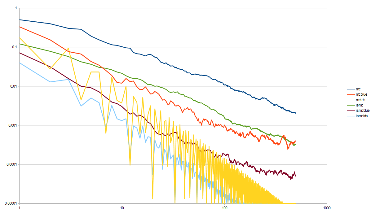
Here is the second experiment, comparing MC to MIS, now with blue noise. You can see how again the blue noise quality is between white and LDS as far as variance is concerned.
Here is the third experiment, showing the effectiveness of the piecewise importance sampling, using MIS. Once again, blue noise has variance between white noise and LDS.
Links
Here are some other great links for learning about MIS via different points of views and different explanations.
https://www.breakin.se/mc-intro/index.html
https://64.github.io/multiple-importance-sampling/
Veach’s thesis that introduced MIS and goes into quite a few other options for MIS, as well as more rigorous proofs on variance bounds and similar https://graphics.stanford.edu/courses/cs348b-03/papers/veach-chapter9.pdf
Thanks for reading!


