My name is Alan Wolfe, and I’m a game and engine programmer with over 25 years of experience. I’m also a graphics researcher with patents, published papers, book chapters, and conference presentations. Lastly, I am the creator of the open-source rapid graphics R&D platform, Gigi (https://github.com/electronicarts/gigi), which demonstrates the future of real time render pipelines by enabling graphics programming at the speed of thought.
I’m currently exploring new opportunities and looking for the following roles:
- A Game or Game Engine Team – making a specific title. (Gameplay, engine, graphics, … )
- A Shared Engine Team – supporting multiple titles or commercial customers.
- Game Dev or Graphics Research – or research in similar topics.
- Continuing Gigi Development – towards aligned business goals.
- Related Technology – working on technology that enables game development or graphics practitioners.
The ideal position is remote, as I’m not looking to relocate, but Orange County, CA roles could work as well. My resume is at https://demofox.org/Resume.pdf
I am motivated by:
- The creativity of making games, and the technical challenges that come with making them work.
- Searching for creative solutions to unsolved problems and pushing forward human knowledge, while also sharing rarely known but useful bits of knowledge with others and helping them understand and apply it.
- Enabling others to achieve more with less time and effort.
The three sections below go into the details of each area of specialty.
Game, Engine & Real Time Rendering Programmer
I originally started programming to turn creative writing into interactive experiences, but found game development itself to be a very wide and deep field, with many wide and deep sub-fields. Over the years I’ve been a generalist, and have also been a specialist in several areas. The fields I’ve specialized in are:
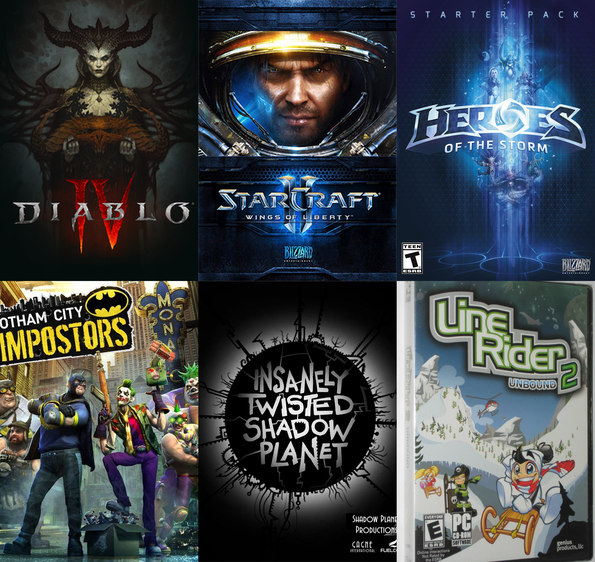
- Rendering – I was one of two rendering engineers while on Diablo 4, I did some graphics work on Starcraft 2 and Heroes of the Storm. At Blizzard I was tasked with making a rendering solution for a company wide shared engine which could support any game genre on any platform. That led to Gigi. While at NVIDIA, I made the RTXGI UE plugin. I have also been a graphics researcher for the last 5 years and am known in the industry as “the blue noise guy”. My graphics research has ended up in several games withing and outside of EA, and is also found in the Unreal Engine, including as part of Lumen, where you can see them showcase it as part of the explanation of how their technology works.
- Audio Programming – One of my duties on Starcraft 2 and Heroes of the Storm was audio programming. This involved both gameplay level audio features, but also lower level debugging, and writing custom DSPs. A limiter and compressor I wrote that works in dB space and has quick attack times was adopted widely across the company for other games as well. Audio (and making music!) is my second love behind graphics, but it doesn’t get as much time dedicated to it.
- Skeletal Animation – I was the animation programmer on a canceled open world Midway game “This is Vegas”, and also on the shipped monolith game “Gotham City Impostors”
- Online Engineering – Having games talk to web services / databases for things like community challenges and user generated content. I have written the servers for these on a few occasions, and I have also done some basic network programming. I’m comfortable writing TCP/IP servers and clients, and can do UDP if pressed!
As a generalist, I’ve of course done extensive work debugging, profiling and optimizing, and in crafting “right sized” systems for problems, innovating algorithmically when appropriate, and keeping it dead simple when that was the best solution. I can read and write assembly, though reading is easier.
I’ve found that every game genre has a “secret sauce” and have worked on FPSs, RTSs, MOBAs, open world streaming games, physics based games, dungeon crawlers, metroidvanias, web games, mobile “idle” games, and games with user generated content. I find peer to peer deterministic simulation to be extremely interesting, and enjoyed working in that environment while working on Stracraft 2 and Heroes of the Storm.
I tend to enjoy small teams over big ones because it’s easier to move faster and “do the right things” without getting caught up in meetings or process. No one can do everything on their own, though, and reasonable timeframes necessitate parallelizing work, so there is a balance. I’ve also been the lead of small teams, and can lead when it makes sense, but prefer to be hands on and doing work, rather than being focused on management duties. I am also happy to mentor people and over the last 5 years at EA have mentored ~10 people in graphics, while also mentoring a couple people outside of work as well.
Machine learning is the topic du jour, and I do have knowledge in this area:
- Automatic differentiation with dual numbers (forward mode AD)
- Back propagation (backward mode AD)
- Gradient descent, Adam.
- MLPs and CNNs. I’d love to get more practice with them, and also to learn VAEs.
- MCP servers to let agents interface with software more easily.
I have a video entitled “Machine Learning For Game Developers” where I go through the details of the bare metal parts of machine learning: https://www.youtube.com/watch?v=sTAqWRsEiy0
You can also interact with numerical digit recognition machine learning implementations I made in Gigi and then code generated to WebGPU. There is a version that uses a MLP, and another that uses a CNN, and runs in compute shaders on the GPU: https://electronicarts.github.io/gigi/
You can see a large number of technical game dev related topics that I’ve written up over the years on the root of this blog: https://blog.demofox.org/
Graphics Researcher
My main area of research relates to rendering noise, sampling, and stochastic rendering algorithms. There is more to do, including combining what I’ve done with learning algorithms. An overview of the basics my video “Beyond White Noise for Real-Time Rendering”. The first half explains the basic ideas, and the second half shows how to apply it to rendering:
https://www.youtube.com/watch?v=tethAU66xaA
I started my blog in 2012 as a way to show an idea I had which combined the concepts of “dirty rectangles”, gbuffers, and ray tracing. The idea was to enable real time raytracing by only having to re-render small parts of the screen each frame. I didn’t know it at the time, but that is the point my research path began.
I continued to blog over the years, which built up my research skills. I wrote whenever I had ideas I wanted to share, sometimes thinking they were novel when they weren’t (I thought I invented interpolation search!). Also, whenever I learned a rare piece of knowledge, or something that was challenging to learn, I would write up the explanation I wish already existed, and would make a working implementation in the simplest, plainest code I could make to help others understand it better. It also helped me understand things better and the blog became an “external memory” where I could quickly come back up to speed on a topic I had learned years prior.
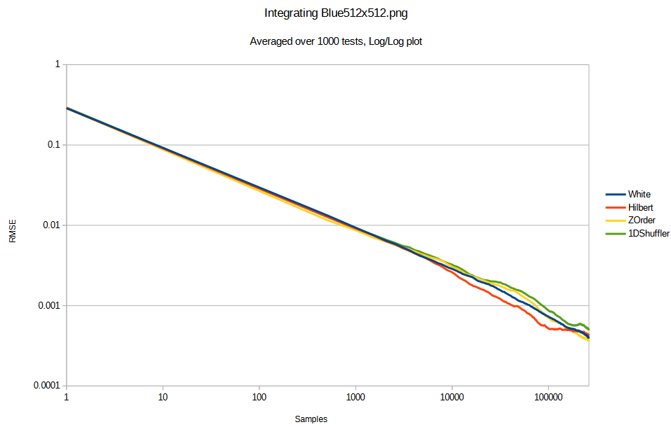
At some point I became fascinated by low discrepancy sequences, and blue noise. Blue noise fascination was largely driven by the game “INSIDE” by playdead, which used blue noise to make very pretty scenes with minimal computation. They made a great youtube video here where you can learn about it: https://www.youtube.com/watch?v=RdN06E6Xn9E
My fascination became action while working on Diablo 4 and the game needing a way to do stochastic transparency. This was to allow objects to fade out while using the richer deferred lighting, instead of having to switch to forward lighting which was a very obvious transition and a lot uglier lighting. I used the alpha value of objects to threshold a 2d blue noise texture to make arbitrary density blue noise points which had the correct density for the given alpha value. I then added the golden ratio each frame to the blue noise texture to make it not only blue over space, but also low discrepancy over time. This made it look very nice under temporal anti aliasing and if you play the game, you might not even notice that the fade is stochastic. In many cases it looks like true transparency.
I later left Blizzard and joined NVIDIA, working in dev tech, and some researchers there asked if I might know how to have screen space points follow a blue noise distribution for arbitrary densities, while also having good temporal properties for integration. This is exactly what my stochastic transparency solution in Diablo 4 did. However, I had some more time to think about the Diablo 4 solution and realized that the golden ratio addition over time damaged the blue noise over space, and actually made the cutoff frequency “significantly strobe” higher and lower over time, which wasn’t great.
To try and make a better spatiotemporal blue noise mask, I adapted the void and cluster algorithm (which is used to make blue noise textures) to make noise which was not only blue over space, but also, each individual pixel should be blue over time – blue meaning “high frequency” and “isotropic” here, without worrying too much about specific frequency makeup beyond that. This worked well!
At around the same time, there was an excellent publication called “Blue Noise Dithered Sampling” which effectively showed how to make blue noise textures which had vector values per pixel, instead of only scalar, and showed how to use them to make amazing renderings at the lowest of sample counts: https://iliyan.com/publications/DitheredSampling/
I made a second technique for making spatiotemporal blue noise textures that involved simulated annealing, much like that paper, to randomly swap pixels to improve a scoring function.
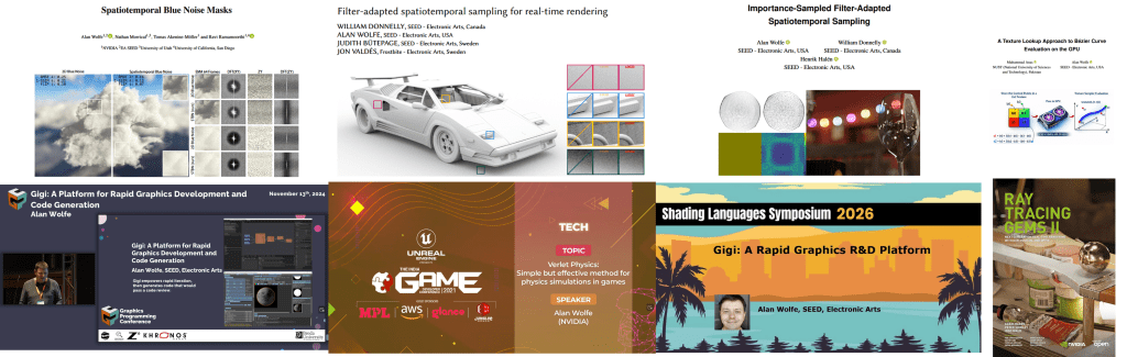
We published that paper as “Spatiotemporal Blue Noise masks”.
I left NVIDIA and joined SEED at Electronic Arts as a graphics researcher, where I presented my work on spatiotemporal blue noise, and I nerd sniped a couple super smart, and very cool people to work in the problem space with me.
One of these people, William Donnelly, realized that my scoring function was not optimal, and he derived a better scoring function for both scalar and vector values, and also generalized the work to allow you to choose arbitrary spatial and temporal filters. This makes noise that is not only better perceptually, but can alternately be designed to just be more easily filtered by any specific denoising filter. We then published “FAST: Filter-Adapted Spatio-Temporal Sampling for Real-Time Rendering”.
From there, I did a small follow up paper explaining how to use blue noise point sets to make FAST noise textures which had importance sampled vectors in them. “Importance-Sampled Filter-Adapted Spatio-Temporal Sampling”.
There is work left to do with higher dimensional sampling, but the area is solved in a lot of ways and is waiting for the rest of the industry to catch up IMO. Our work has been cited by other research – when we presented FAST, the best paper award went to an NVIDIA paper which used STBN (what FAST improved on) – and our work is also used by games within EA, and also outside of EA. You can also see our work in Unreal Engine’s Lumen writeup. Go there and search for “blue noise” to see it: https://www.unrealengine.com/tech-blog/lumen-brings-real-time-global-illumination-to-fortnite-battle-royale-chapter-4
I believe next steps in these areas would be to either optimize noise and noise filters together (for specific situations), or to give blue noise point sets the same properties we gave to blue noise textures. I have the beginnings of a spatiotemporal blue noise point set working using optimal transport (would be useful for sparse rendering, and many other things), but it needs some more work.
There is an entirely different direction to pursue as well, in the same problem space.
Noise textures and sampling patterns aim to be the best they can be when working blind. In contrast to this are algorithms like restir, which learn the details of what is being sampled. A better version of restir would use good noise and sampling when it was unsure about the data it had, and would rely on the learned samples more when it was more confident. There is a continuum here where good noise is good for exploration, and learning is good for exploitation, and a good algorithm would use both appropriately.
Restir is just one of a family of many possible real time friendly rendering algorithms. There is a whole Pareto frontier of algorithms that live in this space, being able to trade speed for quality. In short: any place a random number is used in rendering, or COULD be used in rendering (like a stochastic filter), there is a place to drop in a sampling and learning algorithm. This algorithm could be neural, or it could be something like a Kalman filter, or a particle filter, or anything else.
There is no shortage of places where random scalars / points / vectors are used in rendering, or where they could be used. Each of these represents an opportunity for advancement.
Note: I have done other research along the way, but this blue noise work has been the main thread. I also have 2 patents.
The last paper I worked on was accepted and is in the process of being edited. A student from Pakistan asked me how to get into graphics research, and I suggested we write a paper together, with him being first author. We re-wrote a rejected paper I wrote in 2016 about abusing the texture interpolator to evaluate Bezier curves, and he found newer relevant research that doubled the contributions the paper adds. The ultimate result of the work is it shows how to offload compute onto the texture sampler, which can help in compute bound work loads. He did a great job, and it was a great collaboration. He is now working on another paper with another researcher, so it seems like our project was successful in jump starting his work.
My ORCID is: https://orcid.org/0000-0001-9100-4928
Throughout the research at SEED, we used Gigi, a rapid graphics R&D platform I built, to make experimentation and development quicker and easier. I will be talking about that next.
Rapid Graphics R&D Render Pipeline – Gigi and Beyond
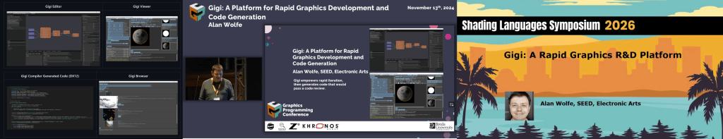
Gigi is version 3 of concepts that started while I was at Blizzard.
Gigi Repo: https://github.com/electronicarts/gigi
Interactive WebGPU Code Generated Example Gallery: https://electronicarts.github.io/gigi/
At Blizzard, each game team works almost like it’s own game company, using it’s own proprietary game engine (for the most part). This made it challenging for people to move between teams since the technology varied so much, and it also made it hard to know which engine to use when a new prototype game team would start up.
I was recruited internally for a “shared game engine” initiative, to make an engine which game teams could use to prorotype or develop future games on. I was tasked with making a rendering solution which could service any game genre Blizzard might want to make, on any platform.
I quickly decided that was far too many constraints to put on any render pipeline, and that the solution had to be that the render pipeline was loaded from disk as an asset. More specifically, the solution was to describe a render graph in data, instead of code. This way, each game could have its own right sized renderer, with the features they wanted, without a sea of complexity that dealt with functionality they didn’t want or need. Of course, nobody wants to start a render pipeline from scratch, so there needed to be a library of situationally appropriate renderers for games to start from, and modular rendering techniques they could plug into their render graph.
A nice side benefit of this is that the render graph is fully statically analyzable, which enabled some nice profiling and debugging features through reflection. For instance, you could view resources at any stage in the render pipeline in real time, as if you did a renderdoc capture, but without actually having to take a capture.
Another nice benefit is that you could change render pipelines at runtime by choosing a different one from a drop down menu. This would let you quickly and easily see how what you were looking at would look on the console or mobile version of the renderer.
Like many exploratory initiatives in game development, it was ultimately shut down due to shifting business priorities and cancelled prototype projects, though the technology influenced later work at the company.
Version 2 of this idea came up while I was at NVIDIA on the dev tech team.
In dev tech, there were a lot of effort to port research or implement technology features into various internal and external platforms. Internally this would mean things like Falcor or Omniverse, and externally this would mean things like DX12, Vulkan, Unreal Engine, Unity, and the myriad of proprietary engines that game partners used.
All this porting and implementation took a lot of time and effort, and each implementation ended up diverging from the rest because they were written by different people, and for different goals. That meant that if you wanted to update a technique across the board – to improve quality, perf, or do a bug fix – that this “small patch” would end up being almost as much work as the initial implementation.
While making the RTXGI (DDGI) plugin for Unreal, I realized that if you had a description of a render graph, you could generate the code to implement it. Not only that, the code generated could look like it was written by a human and pass a code review.
When working this way, doing an update for quality, perf or bug fixes meant just regenerating the code and dropping it in. Also, by necessity, the code ended up being a lot more modular than code a human would write. A human familiar with a system knows all sorts of short cuts to get at things more easily than a formal interface, and the temptation is too great sometimes to just get something done, even if done in an ugly way.
NVIDIA was exploring several solutions including cross-platform libraries and extending Slang. I focused on code generation because it solved a specific problem: game developers want to integrate techniques into their existing codebases without external dependencies. Generated code could be reviewed, modified, and maintained just like hand-written code.
My ideas worked well as a proof of concept and I used it in the RTXGI UE plugin.
Eventually I left NVIDIA and joined SEED at Electronic Arts where version 3 came to be.
At SEED, the challenge I was trying to solve was that it’s hard for many researchers to work against direct APIs like DX12 and Vulkan. Alternately, engines like Frostbite, Unreal, Unity can be a steep learning curve, they can be slow to iterate with. Also, when your work is part of a large rendering pipeline, it can be hard to know what else in the engine might be affecting the performance and quality of your results.
Gigi was born to be a place where people could do GPU work against real time graphics APIS, they could work at the speed of thought, be confident in their results, automate tasks with python, and when they were done, they could code generate their work to Unreal, Frostbite, DX12, WebGPU, and other platforms added as needed.
Electronic Arts was super kind and allowed me to open source this creation with a permissive license, so it can continue to exist in whatever form it takes in the future, by whoever continues development: https://github.com/electronicarts/gigi
You can also see a gallery of example techniques code generated to WebGPU here, which include machine learning applications: https://electronicarts.github.io/gigi/
Gigi has had contributions from inside EA and outside EA. There are of course bugs, and features that needed improvement, but I have only had positive feedback about the core concepts of how it works. Researchers like it because they can do what needs to be done without a lot of fuss. Graphics programmers like it because they can rapidly prototype ideas and find the wins before spending the effort to make it work in their engine. Graphics novices like it, because they can focus on just writing shaders, while getting access to the full power of the GPU.
There are a lot of “secret sauce” learnings from making Gigi, including things I wish I would have differently. The core of what Gigi is, though, is:
- Editor – You describe a render graph as data in the editor
- Viewer – You can load the render graph in the viewer to iterate (with hot reloading), profile and debug it. Change technique parameters, move the camera around, change what assets are used as inputs, using python to automate data gathering and similar.
- Compiler – Code generate what you made to another platform. The code it emits looks as if a human wrote it with well-named variables, comments, proper indentation, and would pass a code review.
Gigi supports work graphs, ray tracing, compute shaders, rasterization, it is set up to support dx12’s tensor core access “linalg” when the driver support comes, it has an MCP server, it is python scriptable, it supports slang to let you write shaders that use automatic differentiation, and can run onnx through DirectML nodes. It’s set up to do modern R&D – both research and development, truly.
Gigi itself is great software, but I feel the real lesson is that engines can – and SHOULD – work how Gigi works.
Graphics programming is harder than ever. You need to be an expert engine programmer before you can see your first triangle, and then you need to know calculus, statistics, the physics of light, the rendering equation, microfacet theory, perception, PBR, path tracing, a multitude of rendering techniques, and so on..
The ideas behind Gigi remove the requirement of being an expert engine programmer and let people focus on the second part, which is already more than enough for any one person.
Gigi has a simple interface that lets people work quickly and easily. When you code generate the Gigi technique, it’s full of the required boilerplate complexity that things like DX12 and Vulkan (or even large engines!) need – and it generates that code CORRECTLY. To me, that is proof that the complexity isn’t needed. It hasn’t added any information.
Gigi simplifies graphics work through a few main avenues:
- Subtractive Abstraction – Gigi uses the same abstractions you use when using a modern API or engine. It looks very familiar to those who already know graphics programming. Gigi finds ways to remove complexity without removing power. An easy example of that is that resource barriers are automatic in Gigi, and resource lifetime management is just specifying whether a resource is transient or persistent.
- RHI Is The Wrong Abstraction Level – When people make renderers, one of the core pieces is an API abstraction that encapsulates modern and legacy graphics APIs. Making one that performs well and doesn’t leak implementation details is very hard. Impossible even. Gigi works at a higher level where nodes say “rasterize this mesh to these color and depth targets” or “run a compute shader” and similar. Working at the higher level, a platform is able to interpret the render graph actions however it wants, as long as it honors the read/write order and other constraints. That means a tiled renderer could combine raster and compute, if the resources involved were compatible with that. Working at a higher level gives a back end more freedom to do what it would like to do ideally for a given piece of rendering work, instead of an API that has to satisfy all platforms at once.
- Render Graph As Data – Instead of making a single render graph to support all game types and platforms, you have the freedom to make a different render graph per platform and game. You can also share common work through sub graphs. This lets you get to a state where when you modify your rendering pipeline for your game on your platforms, you only have to think about your game, or the specific platform you are working on. You don’t have to consider everything else at the same time and try to come up with a compromise they are all happy with. Just make what you need for your specific situation and use it.
We can do better, graphics programming can be easier, and I’d love the chance to make that a reality for all of us. If you agree, drop me a line.
Thank you for reading!
– Alan


 to mean expected information entropy, but in other sources you’ll commonly see it as
  where
where  is the event, and
  are the outcomes.


 , we can calculate the derivative as
  . Here are those two functions graphed.

 and wanted to know whether you should go left or right to get lower, the derivative can tell you. Plugging 1 into
  gives the value -4. A negative derivative means taking a step to the right will make the y value go down, so going right is down hill. We could take a step to the right and check the derivative again to see if we’ve walked far enough. As we are taking steps, if the derivative becomes positive, that means we went too far and need to turn around, and start going left. If we shrink our step size whenever we go too far in either direction, we can get arbitrarily close to the actual minimum point on the graph.
 and getting the value
  . Without iteration, we found that the minimum of the function is at
  term of a quadratic is negative, then it only has a maximum, instead of a minimum.
 that is a local minimum for x but a local maximum for y. The gradient will be zero in each direction, despite it not being a minimum, and the simulated ball will get stuck.
 , a gradient is a vector of derivatives, where you consider changing only one variable at a time, leaving the other variables constant. The notation for a gradient looks like this:
 , that means “The derivative of w with respect to x”. Another way of saying that is “If you added 1 to x before plugging it into the function, this is how much w would change, if the function was a straight line”. These are called partial derivatives, because they are derivatives of one variable, in a function that takes multiple variables.
 .
. .
. .
. .
. .
. .
.


 . The value
  is what number is on the dice face, and the value
  says how many faces have that value.


 so that
  is 0.
is 0. because it makes all the
  power terms go away and leaves only the value of
  .
. because that will make all


 . The only way that can be true is if each dice has the
  . If we plug 1 in for


 , the
, the  which simplifies to:
 .
.


 can be true, when
 ![A,B,C \in [0,6]](https://s0.wp.com/latex.php?latex=A%2CB%2CC+%5Cin+%5B0%2C6%5D&bg=ffffff&fg=666666&s=0&c=20201002) .
. . If we want to do that three times – once for A, once for B, once for C – and add them together, we multiply that generating function by itself three times, aka we cube it.

 is 28, which means there are 28 different ways to add the three numbers between 0 and 6 together, to get 12.


 into infinity, but we know there are 20 jellybeans total, so we can stop at 20.